Plotting the Affect Circumplex in R
I’m a strong adherent to the circumplex model of emotions introduced by James Russell in the late 1980s. Russell argued that all emotional experience can be boiled down to two dimensions: valence and arousal, with valence being how positive or negative you feel and arousal being how sluggish or emotionally activated you feel. The emotions we commonly label as anger, sadness, joy, etc. can be mapped within this affective two-dimensional space, such that joy is a high valence, high arousal emotion, whereas boredom is a moderately low valence and low arousal emotion.
This kind of model is great in the field of emotion dynamics, where we are interested in how emotions change over time. It’s great because we don’t have to get bogged down in philosophical debates about whether someone is in a state of sadness or not, but can instead focus on quantifying and mapping changes in valence and arousal. For my doctoral dissertation, I’m using the circumplex model of emotions to explore how emotions change over time in instances when people are alone or with others. Briefly, I’m interested in whether being alone reduces arousal (i.e., makes you more calm). Some evidence in support of this is offered in a recent paper by Nguyen, Ryan, & Deci (2018), although they didn’t use a circumplex approach to emotions.
The circumplex model shines in another way: because it models emotional states in two dimensions, it can be presented visually. This is what I’m attempting to do for my own research. So for now, I’ll simulate some data akin to what I’ll be analyzing in my dissertation, starting simply with just two time points and one condition. The data will represent participants’ valence and arousal (Likert scale of 1-7) at baseline and the same measurements one hour later. I’ll use the simstudy package to generate the data.
library(simstudy)
library(tidyverse)
Here’s the code for simulating the data and binding it all together. I’m using the function genCorGen to simulate and generate correlated data for valence and arousal, respectively. In this call, the params refer to the mean and standard deviations, while rho is the correlation coefficient.
set.seed(190113)

dx <- genCorGen(600, nvars = 2, params1 = c(4.79, 4.02), params2 = c(1.3, .9), dist = "normal",
                rho = .67, corstr = "cs", wide = TRUE,
                cnames = c("valence1", "valence2"))

dv <- genCorGen(600, nvars = 2, params1 = c(4.12, 3.97), params2 = c(.80, 1.2), dist = "normal",
                rho = .43, corstr = "cs", wide = TRUE,
                cnames = c("arousal1", "arousal2"))

core <- data.frame(round(dx), round(dv[, c(2, 3)]))

core$valence1[core$valence1 > 7] <- 7
After generating the data for valence and arousal, I binded the two variables, rounded them to the nearest integer, and trimmed cases that exceeded the 7-point cut-off.
library(psych)

describe(core)
## vars n mean sd median trimmed mad min max range skew
## id 1 600 300.50 173.35 300.5 300.50 222.39 1 600 599 0.00
## valence1 2 600 4.81 1.10 5.0 4.84 1.48 1 7 6 -0.16
## valence2 3 600 4.06 0.94 4.0 4.05 1.48 1 7 6 -0.01
## arousal1 4 600 4.14 0.92 4.0 4.15 1.48 2 7 5 -0.10
## arousal2 5 600 4.08 1.14 4.0 4.09 1.48 1 7 6 -0.05
## kurtosis se
## id -1.21 7.08
## valence1 -0.12 0.04
## valence2 0.17 0.04
## arousal1 -0.26 0.04
## arousal2 -0.05 0.05The summary statistics check out. So now it’s time to plot the data. The function I’m quaintly calling circumplexi takes four vectors as inputs (time 1 valence, time 2 valence, time 1 arousal, time 2 arousal) and returns a circumplex plot. As it stands, it’s not the most intuitive function, but it produces a decent looking plot.
circumplexi <- function(valence_time1, valence_time2, arousal_time1, arousal_time2) {
  v1 <- valence_time1
  v2 <- valence_time2
  a1 <- arousal_time1
  a2 <- arousal_time2

  v1mean <- mean(valence_time1, na.rm = TRUE)
  v2mean <- mean(valence_time2, na.rm = TRUE)
  a1mean <- mean(arousal_time1, na.rm = TRUE)
  a2mean <- mean(arousal_time2, na.rm = TRUE)

  ggplot() +
    geom_segment(aes(x = (min(v1) + max(v1))/2, y = min(v1), xend = (min(v1) + max(v1))/2, yend = max(v1)), color = "gray60", size = 1) +
    geom_segment(aes(x = min(v1), y = (min(v1) + max(v1))/2, xend = max(v1), yend = (min(v1) + max(v1))/2), color = "gray60", size = 1) +
    geom_point(aes(x = a1mean, y = v1mean, size = 5, color = "Time 1")) +
    geom_point(aes(x = a2mean, y = v2mean, size = 5, color = "Time 2")) +
    scale_x_discrete(name = "arousal", limits = c(min(v1):max(v1)), expand = c(0, 0)) +
    scale_y_discrete(name = "valence", limits = c(min(v1):max(v1)), expand = c(0, 0)) +
    geom_segment(aes(x = a1mean,
                     y = v1mean,
                     xend = a2mean,
                     yend = v2mean),
                 arrow = arrow(type = "closed", length = unit(.125, "inches"))) +
    coord_fixed() +
    theme_light() +
    labs(title = "Change in Affect from Time 1 to Time 2",
         subtitle = "Red dot is affect at Time 1. Blue dot is affect at Time 2") +
    theme(legend.position = "none")
}
circumplexi(core$valence1, core$valence2, core$arousal1, core$arousal2)## Warning: Continuous limits supplied to discrete scale.
## Did you mean `limits = factor(...)` or `scale_*_continuous()`?
## Warning: Continuous limits supplied to discrete scale.
## Did you mean `limits = factor(...)` or `scale_*_continuous()`?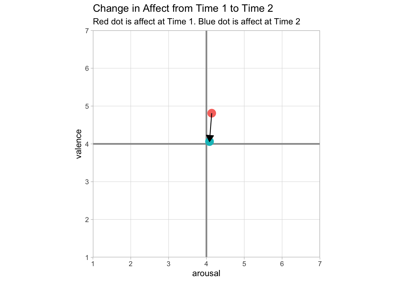
In this example, the plot shows that affect becomes more neutral (i.e, returns to baseline) following Time 1. In my own research, I’ll be using circumplex plots to depict this change between multiple groups as well. For now, this is a good start.